-
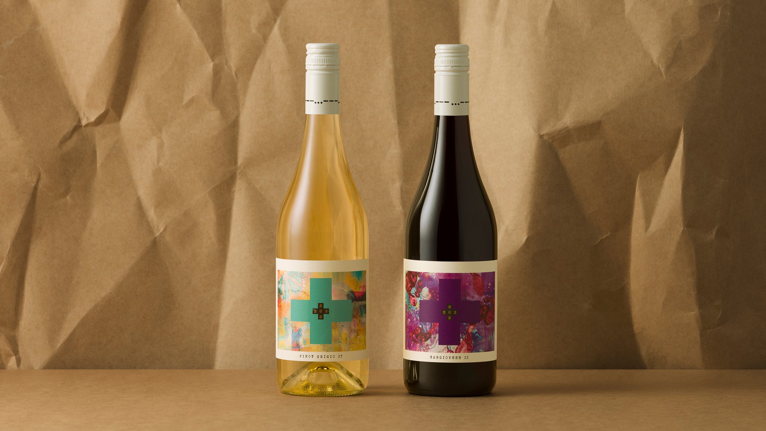
SOS (Save our Souls) came to us to refresh their brand after sales had declined. The feedback from their retailers was it was hard for the consumer to know who they were or what the varietal on offer was.
The previous branding featured the cross only – no type or imagery.
The brand story is about two souls who unashamedly make wine simple and unpretentious. We developed not only a unique label for each of the seven varietals but created a cohesive look for the branding throughout.
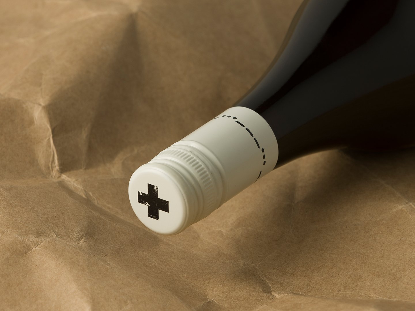
A set of secondary assets have been further developed passed the main logo – the cross without the logo, the Morse code lines for SOS, which run around the cap and on top of the carton, and the silhouette of the two brand owners whose story is told on the back label.
The new labels have only recently been launched but are already getting positive feedback from both retailer and consumer.